Contents
Links
Combinations
What is Visual Material?
Typography
Creating Visual Material
01// PSD Adjust Menu
02// PSD Plugins
03// PSD Layer Styles
04// PSD Layer Modes
Vector Applications
3D Applications
Links for Resources
Photography
http://www.istockphoto.com/
http://www.sxc.hu/
http://www.freeimages.co.uk/
http://www.morguefile.com/
http://www.imageafter.com/
http://www.freefoto.com/index.jsp
Illustration
http://caliban.mpiz-koeln.mpg.de/
http://www.dfrc.nasa.gov/gallery/
(aeroplane blueprints)
http://flood.nhm.ac.uk/cgi-bin/perth/cook/
(botanical drawings)
http://www.bartleby.com/107/
(Gray's Anatomy)
http://www.octavo.com/collections/projects/vlshum/
(renaisance anatomy)
Caution
Make sure that the images you use are free
for usage. The photography links above are free photography resources. The links
for illustration are meant to be inspirational only!
<<<top
Combinations
A combination of the techniques and pointers concerning typography
and image combinations as well as image processing, as discussed
below , used wisely
and tastefully will give you results everytime. Think of what you
are doing, what you are trying to convey: the era, thr mood, the
feeling...
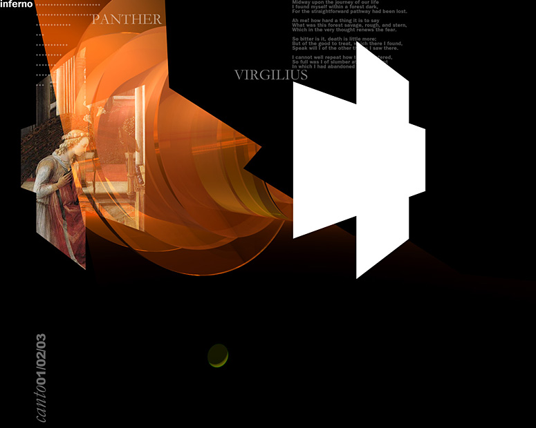
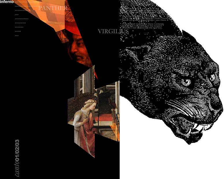
But, at the same time also remember that you are creating work as
a contemporary designer! Below are two screenshots of a project I am
currently working
on, in
the "Renaisance" style:
I used a background created in Bryce (scroll to end of page to view),
above
which I combined
vector shapes
created with the PSD customshape tool, antique clipart from a clipart
CD, Renaisance paintings that I downloded from the Internet (copyright
free resource!) and a very
judicious usage of generic typefaces, namely Swiss and Garamond.
<<<top
What is Visual Material?
By visual material I mean all the bitmap material, be it your own or
stock photography, illustrations, files rendered in 3D applications
such as Bryce and the like as well as clipart, photoshop customshapes,
dingbats and similar vector material. Interestingly enough, even here
I shall dwell upon how important typography is in Graphic Design. You
can ruin the most beautiful visual material by inept usage of type and
you can make a stunning design using fairly indifferent visual material,
provided your type is used correctly: In the below example I have used
the same exact image and only changed the type. Dom Casual, at least
as far as I am concerned is a typeface that there is no conceivable
use for except for a demonsration such as this one. To add insult to
injury I have made the type red and placed it on the page as awkwardly
as I know how...


<<<top
Indifferent Photograph/Good Type:
In the example below you can observe how correctly placed type, enhanced
with simpe lines and shapes can turn even a run of the mill shot into
a sophisticated design. Although type is the most powerful visual element
on your page it should never overpower the work. Hierarchy,
negative space and placement are
the three keywords you need to be extremely aware of when placing type
on a page: Think about what the most important piece of type on
your page is: That is your headline and all the elements on your page
should be placed in such a way that they point
at the headline. Incidentally:
There can be more than one headline on a page, in which case the directional
arrangements have to made accordingly.

Furthermore you can entirely change the "style" of a page
by
changing the typefaces and shapes:


<<<top
Creating Visual Material
There are so many effects and means that you can emloy in processing,
modifying and enhancing your images that the keyword here should be
caution and good judgement at all times. Do not be afraid to experiment
and try out various effects and styles, however be aware that effects
and plugins used for no rhyme or reason other than that they are available
to use can create the most god awful visual mess. Think,
think, think:
What will really enhance your image's content? Does your image look
better or worse for the manipulation? Does the manipulation underline
the content/context of your work? If yes, go for it! But make sure
what you end up with does not look like "process soup"...
<<< top
Photoshop Adjust Menu
You can dramatically change a photographs' look and overall style and
mood
simply by adjusting it's colour values.

Original Image

Levels

Curves

HSL/Colorize + Levels
<<<top
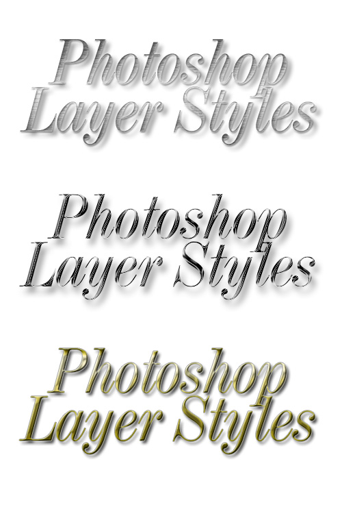
PSD Plugins
Will give you intersting results. Caution:
Be careful, you really need to use your discretion here...
Original Image


Photoshop Layer
Styles
Although a big typographic purist, I am all for Layer Styles and
particularly their usage with Typography. Type has traditionally
been chiseled into stone, inlaid into wood and leather and cast in
precious metals. Layer Styles are but a contemporary adaptation of
what master craftsmen have been doing with type for centuries. You
can however end up with horrifyingly exaggerated layer style "monsters",
with huge bevels, ugly patterns and so on. Again, caution, moderation
and taste are keywords you need to be aware of.
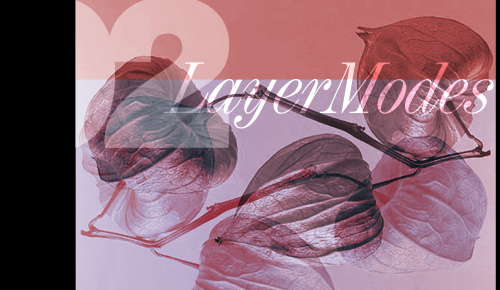
Photoshop Layer
Modes and the Layer Mask
You can achieve wonderful blends and image combinations using the
layer modes
and layer mask. A simple Overlay
Mode effect will make even the blandest
headline shine and sparkle...
<<<top
Vectors Applications
You can use vector applications such as Adobe Illustrator or Macromedia
Freehand
and even Flash to create stunning visual material that is
vector based:

Creature House Expression is an amazing freeware vector application
that lets you
create watercolours and freehand vector art:

<<<top
3D Software
Bryce is an extremely easy and versatile application that
you can use to create
3D images and backgrounds that will convey a lot of mood
and atmosphere:

