Output
1950's retro design styles can be used wherever a nostalgic, mid 20th
century content is present. The whimsical, fun, lighthearted and playful
"pop culture look" of the era can also
be applied to basically any content where this lighthearted feeling is
appropriate. In these cases the product that the design is created for
need not necessarily be founded in the era, i.e. the 1950's. Highly contemporary
products and concepts that call for a playful, humorous and/or illustrative
approach from food to fashion will benefit from having this style applied.
Candy, soft drinks, retro fashion, rock 'n roll events, nostalgia and
music, youth oriented products of many descriptions can be designed with
retro concepts.
On the other hand the highly sophisticated look of mid 20th century modernist design is essentially timeless: Alexei Brordovich's page spreads or Bradbury Thompson's design investigations retain their original impact as much today as on the day that they were published. This style can be applied to any subject matter where refinement and sophistication are called for: Corporate Identities and publications of upmarket businesses, restaurants, haute couture fashion, architecture, interior design firms are those that immediately spring to mind. Bear in mind that the fashion magazine concepts, from the hard serif typefaces to the layouts sets 50 years ago by the likes of Cipe Pineles and Alexei Brodovich are still implemented in todays upmarket fashion magazines, from Vogue to Harper's with practically no significant changes.
Thus we can head in two main directions where design based on mid-century concepts is applicable: The colourful, fun shaped, illustration and clipart oriented "pop" style of the 1950's or the sophisticated, upmarket modernistic look.
Mid
Century Modernist
Keywords
Typography: Hard serif fonts such as Bodoni
and Modern. Also era referenced script and brush script fonts. Here
I will advise caution: There are some very ugly brush script fonts
around,
some
even very
well known and widespread. You will have to use your discretion and taste
but when in doubt err on the side of caution. The same can be said for
the following: Plenty of script fonts have a stylistic reference that
is completely different from retro design in that the reference is essentially
Baroque. Englische Schreibschrift constitutes a very good example. Again
when in doubt, don't use!. You may end up with a stylistic mess...
Layout: Plenty of negative space, strong grid
systems.
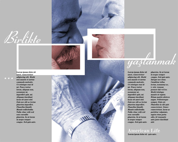
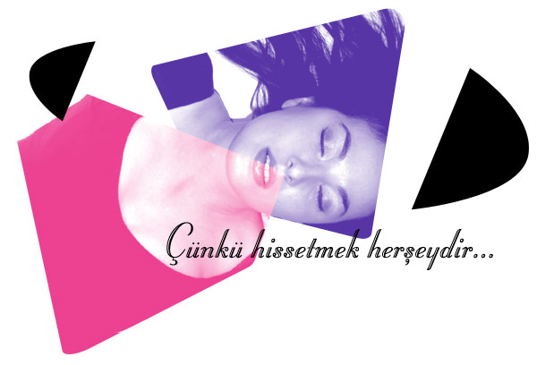
Photography: Is a highly predominant element
in modernist design. Both silhouetted and full sized. Photographs can be
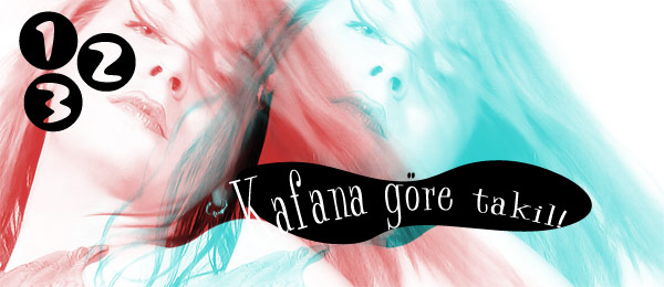
black and white, colour or colorised. A special effect often used by modernist
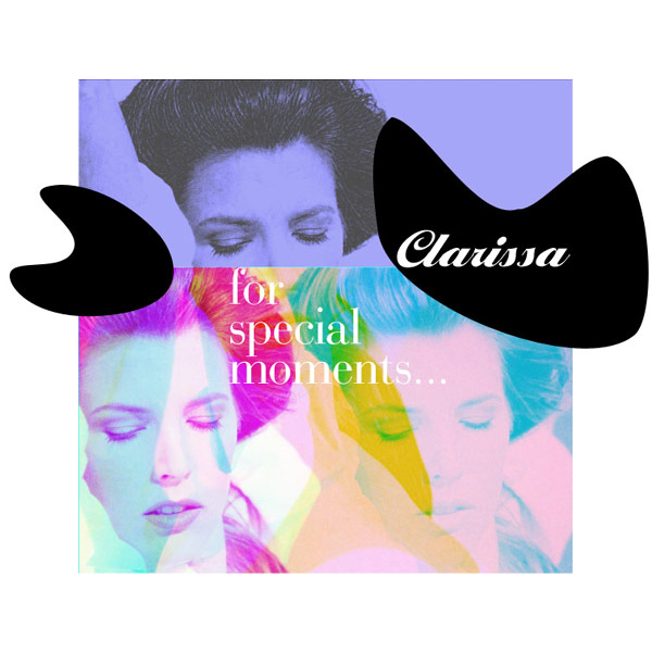
graphic designers is the separation of visual material into its colour
channels: The master of this effect is Bradbury Thompson and I would advise
any budding designer to take a long look at his work - not only for the
usage of photography but also the general layout, visual combinations and
typography.
Shapes: The typical whimsical retro shapes, such
as the kidney shaped elipses may sometimes
be too strong for the stark simplicity of modernistic design, can however be
used in discretion to great effect. Consult previous link on Modernistic design
as
to
how best to
use
these
elements.
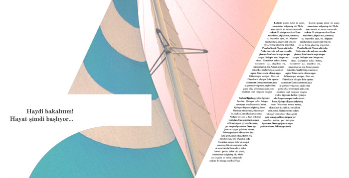
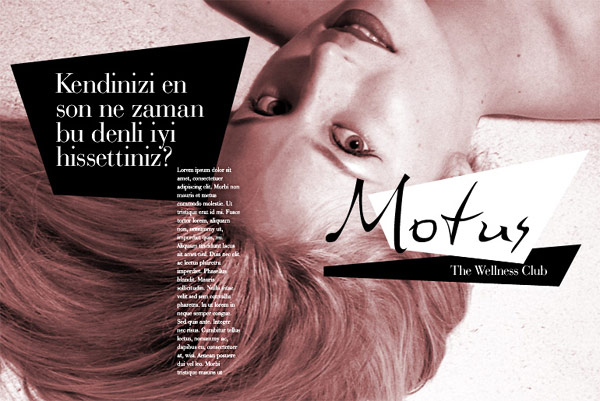
Rectangles and trapezoids, in general are a safer bet.
Plugins: The 1950's seem to me an opportune time to go into the usage of Photoshop
plugins>>>>
Samples:
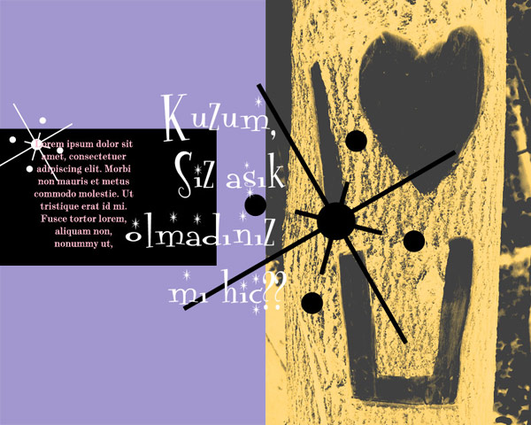
Pop
Retro
Keywords
Typography: A
spoofy, caricaturised version of the above mentioned hard serif fonts
that is extremely dynamic and youthful. There are some
wonderful contemporary interpretations of these as well. The hard serif
fonts are also very much in evidence. Type can be colourful. Again
era specialised script and brush script. The
cautions
above apply to
even
a larger extent: There are very ugly brush fonts around, be careful!
And also be careful of script fonts: These may have Baroque and not
50's retro references.
Layout: A loose layout, with a very loose
grid. Type and type blocks as well as columns can be at angles.
Visual material: Plenty of illustration
and era specific clipart. Again usage of photography, especially silhouetted
photos. Channel separations are also widely used.
Shapes: Go for broke! Use your imagination.
This is vector heaven. As long as you stick to basic premises of fun
and humour you really
cannot go wrong. These shapes will work alone and in combination. Especially
look at the work of Miro for inspiration.
Samples
Plugins