Output
This particular style, Art Nouveau, lends
itself particularly well to the design of packaging
of all things sweet; confectionary, chocolate,
cookies and
all manner of other "naughty" food that we would be so much
better off not eating. Beyond that any luxury food
or drink,
such as truffles, paté, caviar, champagne,
liqueur and cognac labels
or packages, or the corporate/printed material that goes with them can
be
designed
in the Art Nouveau style also.Restaurants and cafes that
have a turn of the century feel and decor are another area of application. Antique
and jewelry establishments
that specialise in artifacts of that era can also get the Art Nouveau
treatment. Art Nouveau has a distinctly European,
especially Central European, quality in its essence, so wherever you
are trying to set this mood, go for it.
Of all the styles that we cover on this website Art Nouveau is quite possibly the hardest to come to grips with in terms of what we try to accomplish here; since it has such a distinctive quality to begin with, and also because Art Nouveau design itself was derived from previous eras and distant cultures.
What we have to bear
in mind, as always, is that we are not trying to create work that looks
as if it was designed in the year 1900! I for one wouldn't even know
how to begin doing that anyway, given the exquisite draftsmanship and
craftsmanship of the designers of that period. what we do have to do,
first and foremost, is to grasp the fundamentals of the design of this
period and then take elements of design and typography from that period
and apply it to our own project.
Material
Art Nouveau
Flowers
Art Nouveau
Ornaments
Art Nouveau
Fonts
Art Nouveau
Dingbats
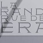
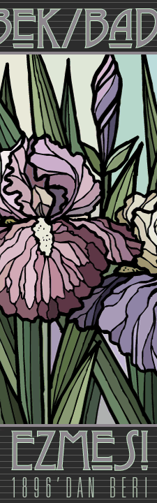
Example 01 "La
Grande Rue de Pera"
I have created 2 menus for an imaginary restaurant on the Istiklal Caddesi
in Istanbul, Turkey, where such establishments are to be found. In fact
my own students will be starting a project for a menu design for an
existing patisserie, the Markiz Pastanesi, in the same location very
shortly.
Art Nouveau design, although extremely well drafted and with very good
perspective in its drawings, is essentially flat. This is largely due
to the contours that the designers of the period loved to use. Contours
are not found in nature and their presence in Art Nouveau graphic design
does have a flattening effect. What I have done with the first menu
is combining Art Nouveau refernced typography with 3D images of flowers
that I rendered in Bryce. The flower is the lotus, a great Art Nouveau
favourite along with the Lily (incidentally, the rose is definitely
not an Art Nouveau flower, stay away from roses
in your projects!). I have used the 3D quality deliberately to
give the contemporary angle emphasis. Another thing that I have done,
not only here both in both menus, is the usage of plenty of negative
space: Art Nouveau design is not exactly renowned for its loose pages;
the designs are often extremely dense. Contemporary design, or at least
the kind that I like, on the other hand, is loose and this is one feature
of it that you should not sacrifice. In the second menu, again I used
Art Nouveau type, and this time, with contours. The flower I used is
the Lily and here I replaced the contour with a Photoshop layer style,
complete with drop shadow, again a feature not to be found in original
Art nouveau design:
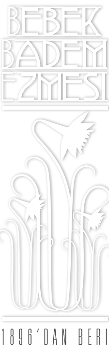
Example
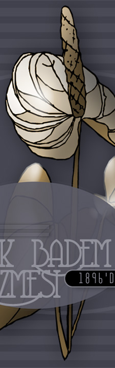
02 "Bebek Marzipan", Confectionary box
The neighborhood of Bebek, in Istanbul, is famous for this establishment
that sells Marzipan. I have re-designed the cover of their boxes in
3 versions. In the first one I used Art Nouveau typography and plenty
of negative space, in the second I again dimensionalised the essentially
Art Nouveau flower. Here as in the 3rd version I used boxes and compartments
for various visual data, such as images or type - something Art Nouveau
designers did continuously. In fact these boxes and the hierarchies
and compartmentalisation that they create are the main reason why Art
Nouveau design is as uncluttered and readable as
it
is, despite
the density of the layouts.
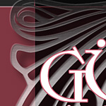
Example 03 "Cameo Corner", website header
Cameo's, relief broaches often depicting portraits in profile in two
colours, were extremely fashionable all during the 19th century and well
into
the Edwardian
era
and thus
can
be looked
upon
as
a product
specific
to the Art Nouveau period. Here I have designed a header for an imaginary
jeweler, who specialises in
cameos.
I have used pewter and gold, emulating the style of Art Nouveau jewelry
and its craftsmanship. Obviously I have adapted this to cı-ontemporary
web
design, aligning objects top and left.
Example 04, Liqueur
Label
Art Nouveau typography and shapes evocative of Art Nouveau (one is
in fact, a quite contemporary geometric array) were used in a design
that is reminiscent of Secessionist wine labels.