This site is designed
for people who are already familiar with the basic premises and concepts
of graphic design and typography. Here, nonetheless are some pointers:
Key Concepts
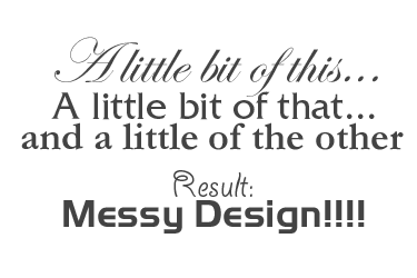
// Do not be ambiguous. Ambiguity when
placing elements on a page is a suicide formula. Be deliberate in what
you
do and let it show.
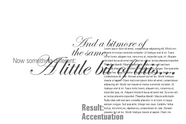
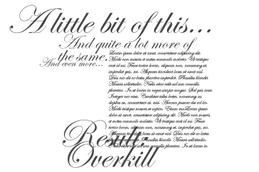
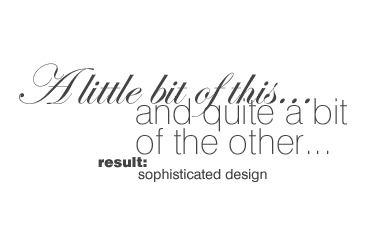
// Use plenty of empty
(negative) space. Do not crowd a page if you can possibly
help it.
// Group things, set up hierarchies.
// Use Generic typefaces as much and as often as you can.
// Be bold! Timidity is yet another suicide formula when it comes
to design.
| Do's | Don'ts |
Be respectful!! I cannot stress this enough: The type, ornaments, elements and all other stylistic references that you use are part of our human cultural heritage. Do not cut and chop and butcher things to suit your needs. Be sensitive: Look and try to understand the references. Try to recognize them. What you hold here in your hands as young designers is part of what makes us humans unique and special... |
|
Typography |
|
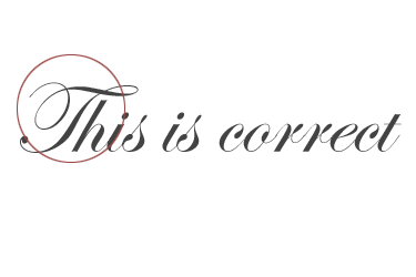
Use Generic Typefaces. |
Do not use fonts because you like the look of them. Make sure that the type you choose does in fact, carry the references and associations your design needs. |
 When using typefaces that convey a certain era, location, mood, etc. it is usually a good idea to use these as accents rather than full texts. |
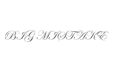
 Do not go overboard with stylistically powerful type. |
 It is perfectly alright to mix one powerful typeface with more than one member of a generic font family. |
 Do not mix powerful typefaces with one another. |
 Caps and initials belong at the start of sentences and words. |
 When setting type do not put initials or decorative caps into full words. |
Layout |
|
|
 With the best of intentions it may not always be possible to design "empty" pages but never crowd a page if you can help it. Use every trick in the book: Group objects, align objects, reduce type sizes; in short do whatever it takes... |
 Group objects and type into hierarchically meaningful clusters and leave space between your groups to ease navigation of the page. |
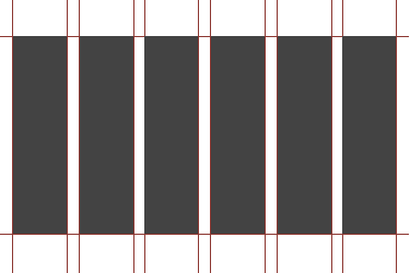
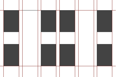 Do not space things evenly. This looks boring. |
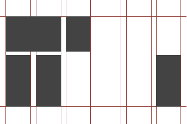
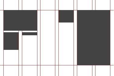 Make sure your objects and typefields are of different sizes and cluster and group the rest around the primary (headline) object. |
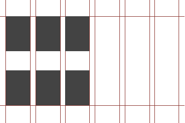 Same sized objects are difficult to group and look boring to boot. |
 Every good design has a grid: You may not see it but it is there. |
 Don't forget the grid! |
 Or deliberately "break" the grid. Space things unevenly, bunch them, crunch them and scatter them. |
 But again: Do not be ambiguous. If you do it, really go for it! |
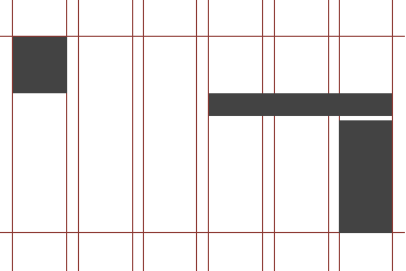
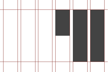
 Align things exactly... |
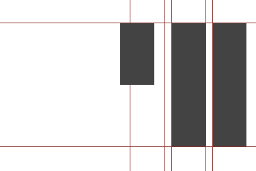
 Never do the above: Objects and type that are "almost" aligned will confuse the eye and make your designs crowded and messy. |
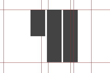
 ...or don't align, be deliberately "unaligned". With the above shapes there is no confusion: We perceive immediately that these shapes are not meant to be aligned. |
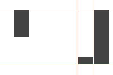
 Do not leave things ambiguous. The above shapes are not aligned, but they are close enough to look confusing to the eye. |
 When cenetering type or objects: Make sure that the things you are centering have enough difference in width. |
 Objects that are almost the same in width, when centered with one another will usually look clumsy. |
 Try to fade in or out of a design... |
 This looks clumsy! It would have been much more effective to let the objects either fade in or fade out... |