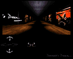
Dennett's Dream

Rather than to display thumbnails, Dennett's Dream uses a hallway metaphor for its gallery. The user uses the navigation arrows to "walk down the hall" and view the images.
|
|
|
|
|
|
|
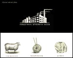
The Idea Factory
Good metaphors tell a story, explain a concept, and provide a practical format for mapping information. What better way to describe the nebulous world of advertising than the concept of turning raw materials into a product?
|
|
|
|
|
|
|
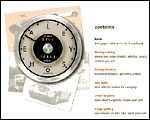
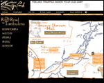
Big Healeys
The best implementation of an odometer-style access counter. The speedometer is cut up into several images, with the access counter spliced in.
|
|
|
|
|
|
|
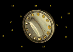
TV Dial
Click on the numbers surrounding the TV dial to "tune into a TV channel."
|
|
|
|
|
|
|
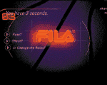
Fila
The Fila site shows it knows when to put animated GIFs in the game by using them to show off Fila shoes and the products' design principles.
|
|
|
|
|
|
|
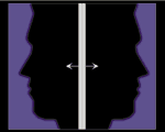
The Fray
The Fray has become well known for its innovative HTML tricks and design, as well as its good writing. Visitors who don't know that they can pull the frames apart can just click on the arrows, which link to a new frame set with the doors open.
|
|
|
|
|
|
|
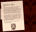
Zoloft Intro Page
Using the low-res/hi-res options of the
IMG
tag, the Zoloft introduction page presents you first with an envelope. When the image specified in the "high-res" portion loads, you see the open letter.
|
|
|
|
|
|
|
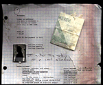
Urban Diary
A notebook sheet, complete with wrinkles, stains, and post-it notes, is the metaphor used for the Urban Diary web site. The image is somewhat on the large side, but the metaphor is great.
|
|
|
|
|
|
|
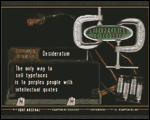
Fine Magazine
When you present your entire site in a pop-up window with no browser buttons, navigation becomes critical. The navigation complements the periodic table look while reinforcing the magazine's branding.
|
|
|
|
|
|
|
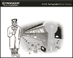
Pioneer Electronics USA
Pioneer Electronics USA's navigation makes exploring this mammoth site as easy as changing your radio station.The navigation is innovative but remembers to include the basics.
|
|
|
|
|
|
|
Elliott/Dickens
Silicon Valley-based ad agency Elliott/Dickens takes advantage of oft-forgotten space by presenting their site not down, but sideways. Their creative team bucks the non-scrolling trend by placing essential nav elements far, far to the right - as the JavaScripted ticker-tape proclaims, "Scroll over, scroll over, scroll over. This site is full of surprises!"
|
|

|
|
|
|
|
Disappearing Inc's Font Arsenal
Disappearing Inc. is a type foundry run by five guys who take hit-and-run typography seriously. The digital design group Red #40 (with members not coincidentally including Disappear Inc. font designers Jeff Prybolsky and Jason) designed and implemented the site.
|
|
|
|
|
|
|
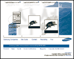
Samsung
Design gurus Simon Smith and Bruce Falck of Phoenix Pop initially won the Samsung project by proposing that the huge company could be encapsulated by a haiku-like entry into the site.
|
|
|
|
|
|
|
Mungo Park
Mungo Park demonstrates a number of important design principles, but I want to focus here on its excellent use of Flash (also known as Flash 2, Shockwave Flash, and previously called FutureSplash). Before looking around the site on your own, make sure to download the incredibly small Shockwave Flash player from Macromedia.
|
|
|
|
|
|
|
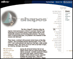
Revo
Web design leaders Studio Archetype, with the skills of manager Karen Roehl-Sivak, design director Jack Herr, senior designer Brooks Beisch, designer Karin Bryant, and producer Nick McBurney, produced this well designed site for Revo. Note the slick JavaScript rollovers that trigger a tiny image of each sunglasses style to accompany each name - these thumbnails are small enough to be subtle, but effective enough to let the visitor browse the shapes.
|
|
|
|
|
|
|
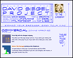
David Siegel - Exit Tunnel
Instead of relying on server-push, David Siegel's exit tunnel places all the images on one page and anchors them with
NAME
tags. Clicking on one image takes you to the next one - the images seem to be server-pushed, but the response is a lot zippier.
|
|

|