Case Study
Client
The design to be created is a logotype for a traditional İskender Kebap
House: "Meşhur Bursalı İskender İskenderoğulları"
Key Concepts
The restaurant is an expensive,
upmarket establishment with a contemporary feel
and furnishings, that nonetheless prides itself on serving traditional İskender
Kebap.
Specifications
#1 The logotype should reflect both the contemporary as
well as the traditional aspects of the establishment
and will be used predominantly for restaurant signs and menu
designs.
#2 .The logotype needs to incorporate the
entire name of the establishment.
#3 .The traditional green colour
of İskender Kebap Houses has to be used.
#4 .Due to the fact that the name to be
written is very long type legibility is
not a must when logotype size is reduced, however the shape of
the logotype has to be legible (i.e. business
card
application).
Due to the fact that the name "Meşhur Bursalı İskender İskenderoğulları" is extremely long, a very sensible approach to designing this logotype will be to wrap the name around a shape. Again the lengthy name makes the usage of a condensed typeface a smart choice. Condensed typefaces will not only economise the space used but are also extremely elegant and thus suit themselves particularly well to this subject; since we are dealing with an upmarket establishment that will benefit from their grace and sophistication. On the left I have used 2 contemporized traditional ornaments. The "watercolour splash" is a vector and was created with Creature House Expression, a freeware software I urge everyone to download and use. The two ornaments on the right are used as is. Note that I do not chop the ornaments to fit the design but rather fit the design around them. The following 4 examples illustrate this:
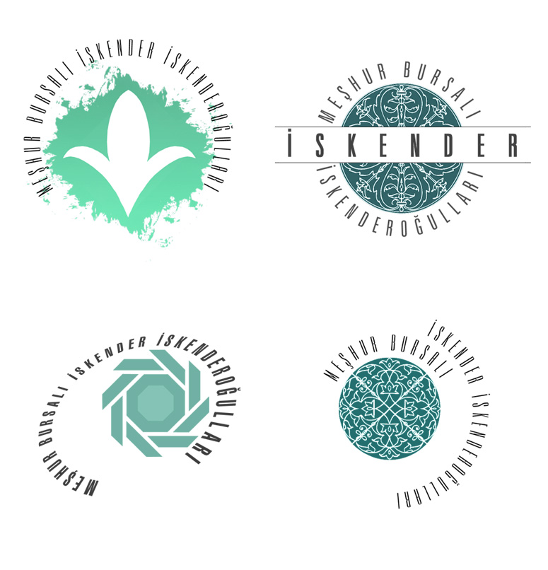
I have used the "Turkish" stylistic reference only very loosely in the following examples and mainly only as a coloristic reference. The top logo has a stylized ornament based on rumis. The middle logo has predominatly coloristic references, although the form within the circle can be loosely associated with kilim patterns. The bottom logo has very loose associations to kufic calligraphy. Although these associations are very loose, the colours as well as the overall balance of the work does give it a distinctly turkish feel...
Stay away from actual calligraphy at all costs, unless of course you can write in Arabic or Farsi in which case feel free to write your own calligraphy. For those of us that can't read Arabic: Bear in mind that calligraphy means something, it is not a meaningless scribble! What you put in your design can easily be read by anyone who can read Arabic, and just imagine how disrespectful, not to mention stupid, you would look with a kebap house logotype that has "Bismillahirahmanirrahim" written on it. The idea here is to create your own shapes that are inspired by calligraphy but are either completely abstract or emulate a shape or ornament. The bottom shape was once again created with Creature House Expression.
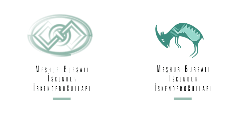
The ram on the right is not strictly speaking "Turkish" but American Indian. It does however remind me very strongly of Turkish kilim patterns and I have used it here in that context. If this were a real project with a real client I would most certainly take the time to create a real shape inspired from a real kilim pattern. The shape on the left was once again created using Creature House Expression and is simply a watercolour rendition of an existing turkish architectural ornament, placed inside an elipse for additional compositional support. Note that again the type here is very very simple, generic type (Zürich/Univers Light XCn); centered with initial caps.