Output
This
particular style distinguishes itself with its elegance,
it's repetitive and highly complex ornaments and patterns and with
it's stunning usage
of islamic calligraphy. Turkish style is sophisticated,
symmetrical, ornate and complex: If one word were to define it's
overall characteristics I would call this style "grown
up". Thus it is essential that your designs
reflect this: Playful fonts and shapes will simply not work. Observing
symmetry, or at least balance is yet another
element that you need to observe stringently with Turkish and indeed
Islamic styles in general.
Turkish style, especially in its ornamentation is quite dense and crowded
and with this characteristic may prove to be a challenge in creating
negative space on your layout. What you need to bear in mind, as always,
is that you are not duplicating the historic style but adapting it
to contemporary design.
Due to the ornate nature of this style I once again stress the usage of Generic Typefaces in your design. The objects and shapes that you will be using will be highly complex, let your type be simple to complement this.
Again I urge you to be respectful: The wonderful ornaments, patterns and calligraphy should be approached and handled with respect. Do not brutally cut and chop as it suits you. Obviously you will stylize and modify; as well as assemble and interpret: Just bear in mind that what you are using is a part of the cultural heritage of this world and approach the subject with that mind. The following examples and the link below will show you that contemporary and highly sophisticated results can be achieved without any bastardisation to the original style whatsoever:
"Meşhur Bursalı İskender İskenderoğulları" Logotype Case Study>>>

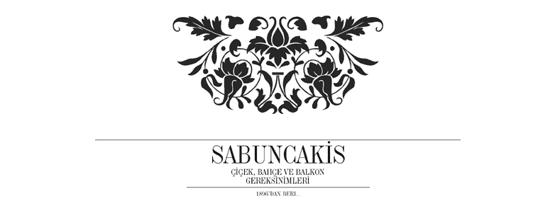
Corporate Identity for florist. Note that the font used is not a "Turkish" font. My advice is to stay away from all kinds of typefaces that emulate an arabic calligraphic feel. Keep your type nice and simple; for the "turkish" influence use ornaments and shapes, as well as colours that evoce a regional feel. Here a PSD layerstyle in blue tones (one of the two colour schemes suggested prviously) was applied to a shape that is in actual fact not turkish per se, bu nonetheless gives a general impression of hatayi ornaments.The florist Sabuncakis is a well known Istanbul institution that has its origins in the late 19th century. This was a period when turkish design was already largely under a western influence and hence the somewhat non-turkish ornament also seems appropriate.

Again generic fonts are used for this design. The colour scheme consists of grey tones, black and white - with just a splash of orange to give us the necessary accentuating element. Turkish design is essentially symmetrical, however you may not always want to use this feature. Do however try to construct pages that are well balanced, if not exactly well balanced since turkish design is also extremely well ordered and proportioned.

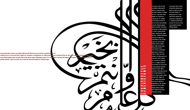
Bear in mind that the idea is to create design that is "contemporary" as much as it is "turkish". Thus you need to employ all the prerequisites of contemporary graphic design, such as plenty of breathing, or negative space, as well as a functional grid system. In the above samples the colour scheme of the turkish flag was combined with black.
.............................................................
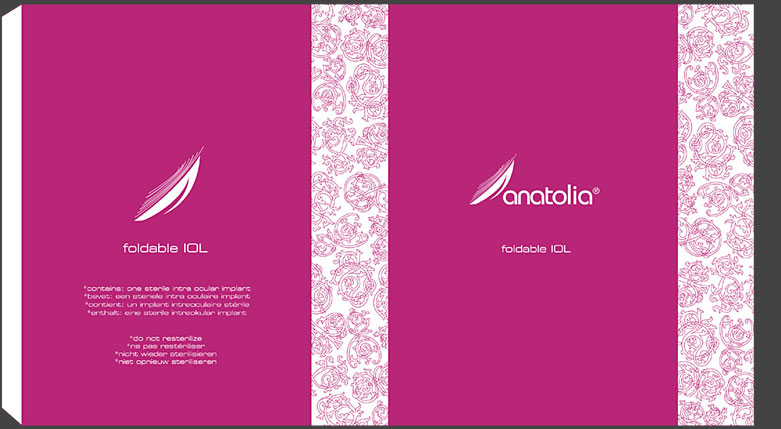
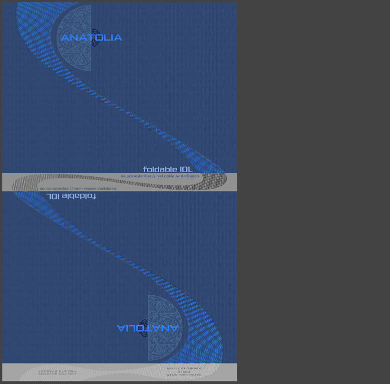
The following are samples from a class project executed by the class of 2004 at the VACD programme at Sabancı University, Istanbul. Turkish stylistic elements and colours were combined with contemporary shapes and type to create these beautiful packages for foldable lenses.
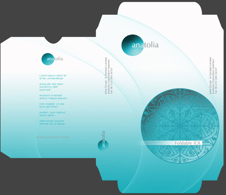
Başak Alper
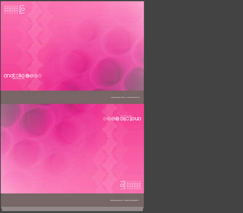
Ege Kanar
Orçun Göğüş
Seçkin Karayol