to
download fonts go to:
http://www.dafont.com/en/
Generic
Typefaces
Type, more than any other
element that you put on a layout will tell a tale: It will remind us of particular
historic periods, geographic locations and cultures and of course,
moods and concepts. Typefaces that have strong "personalities"
almost always have to be used with utmost care and discretion and
only in situations where you are absolutely positive that the typeface
is stylistically correct: Correct as to historic, cultural, geographic
references, as well as concept and mood. Even then these typefaces
usually will benefit from appearing in the company of "better
behaved",
low key fonts: There are very few typefaces that will work for
that purpose, that will be suitable
for
every
design project
and
every
subject, that will not impose their own "personality" upon
the work but will take on the characteristics of the page that
they are embedded in (see example). These fonts will lend themselves
especially well to secondary or body text, but I know from personal
experience
that you can use "Helvetica/Swiss" with its wide font
family literally in any design; from wedding invitations to contemporary
medieval
text
interpretations to corporate work. These verstaile typefaces
we call the generic
typefaces:
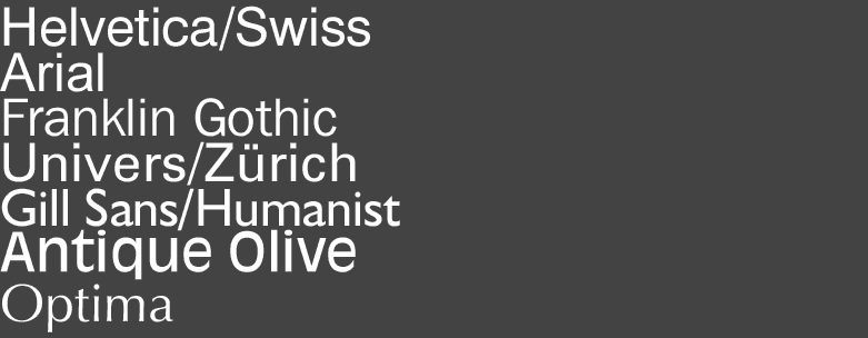
Note
that Futura is not included in the selection above, although most sans
serif
type families are. Futura, although a simple sans serif typeface, has
very strong Art Deco connotations and has thus been excluded.
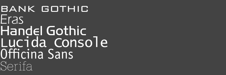
There are certain
typefaces that while not being generic in the strictest sense of
the word, I find work well with a diverse range of styles. These
are
condensed typefaces:

There are certain
typefaces that are non-generic but nonetheless have sufficiently
broad characteristics to be mentioned here:
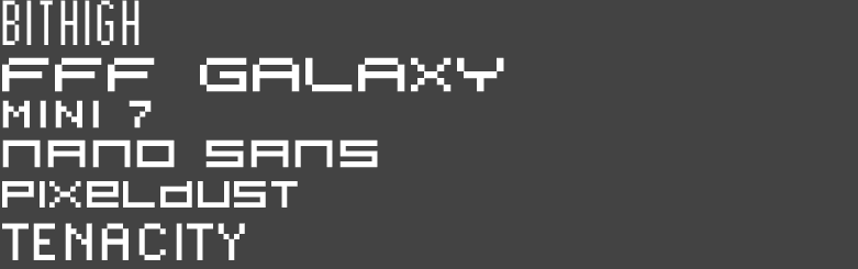
Pixel or bitmap fonts also show certain generic characteristics
and can be utilised in a diverse range of subjects, although
some discretion
as to their usage limits is obviously in order.
Serif typefaces are usually too "serious"
or "corporate" to be used widely, but the below listed can
be used within broader contexts. Again discretion
is called for: I would certainly not design a childrens playground
sign using any one of these: