Strong
Typefaces
As mentioned in the previous link certain typefaces have very strong
associations, or for lack of a better word, personalities. Here we
shall take a brief look at some of these typefaces. It is crucial that
you learn how to associate typefaces with particular eras, locations
and styles. This will not be easy at first but as time goes by you
will surprise yourself with how easily you start to make these connections.
Some of these typefaces may look similar initially: Baroque typography
uses a lot of script and calligraphic fonts, as do the designers of
the
1950's.
Stuyvesant (a 20th century font), to the
untrained eye, may look scarily similar to Englische
Schreibschrift (a baroque font). They are
not: When you take a closer look you will see that Englische Schreibschrift
is sombre and formal whereas Stuyvesant is quite lighthearted
and
playful.
The
only
way
to learn
to make these distinctions is to look at design work
very
carefully
and think while
you are doing so; not just in design books and design sites but wherever
you are, especially
if
you
are travelling
in the western hemisphere.
Remember that these typefaces should only be used within the bounds
of taste and discretion. Use them as Initials
or in the background:
A little bit goes a long long way! In a way strong typefaces
are like spice
in food:
Too
much
of
a good
thing
and
you ruin the meal! Type is the single most powerful element you put
on a page and even one wrong character can completely ruin a perfectly
good design. So be careful, as careful
as you possibly know how...
Geography
Tribal
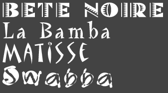
I have serious doubts about even putting these in here, I don't think
I would use them with a gun pointed at me - maybe with the possible
exception of Matisse. Nonetheless, for
what it is worth, these are ethnic/tribally inspired fonts.
Swiss
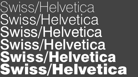
As the name already implies...
Islamic
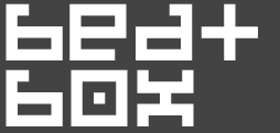
There are no fonts in this category that I can think of and that I
feel totally comfortable putting here. Stay away from the so
called calligraphic or script fonts
that
try to emulate an "Islamic feel". Stick to your generic fonts
for this one. Oh, and... Pixel fonts enlarged will
give you a wonderful kufi effect!
Oriental
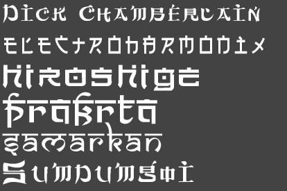
You will, hopefully, be wise enough to steer
well clear of the obvious "Chinese Restaurant Fonts".
The above selection is a more innovative one, based upon an "oriental
feel" but still quite contemporary in design. Especially nice
is Electroharmonix.
Again, I would only use these as ornaments or initials.
Era
Medieval

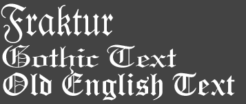
The primary typefaces associated with Medieval times are obviously
the Gothic Typefaces. Above we have a
selection of traditional Gothic type, such as Fette
Fraktur, as well as some contemporary Gothic type
interpretations, such as Barnbrook. Gothic
Type has very strong vertical strokes and very narrow
horizontal strokes due
to the fact that this kind of script was initially written with a sharply
chiseled calligraphic pen and thus carries these characteristics. Another
characteristic of traditional Gothic Typefaces is that these are quite
heavily condensed: Paper was unknown in Medieval Europe and the parchment
that was used to produce the monasterial books was extremely expensive.
Hence the scrittori that designed these books utilised page areas to
the utmost and condensed type enabled them to put more text on an individual
page.

Yet another typestyle that has very strong medieval, especially Celtic,
associations are the Uncials.
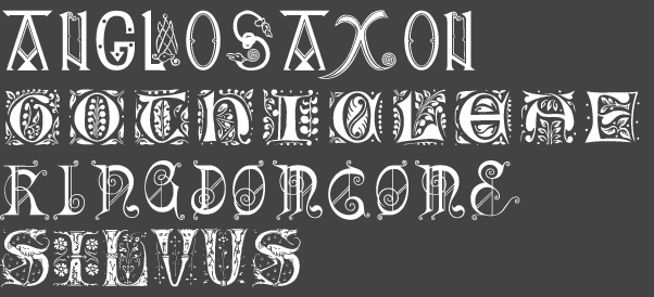
Medieval calligraphy and book illumination is renowned for its type
design that utilises initials. Above are samples of Medieval Initials
and contemporary interpretations thereof. Bear in mind that initials
should never be set into full words and sentences but only
used at the start of words or even better paragraphs.
Renaisance
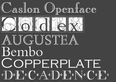
Where typography is concerned The Renaisance is a transitional time. While
on the one hand we still see a great deal of Gothic
Type, albeit less
condensed; on the other especially where titles and uppercase letters
and initials are concerned Roman
characters are certainly making their
presence felt:
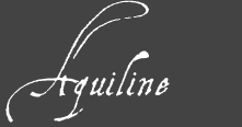
Along with these the renaisance is a time of the personal
notebook (as exemplified by the notebooks of Leonardo da Vinci)
and hence handwriting:
Baroque
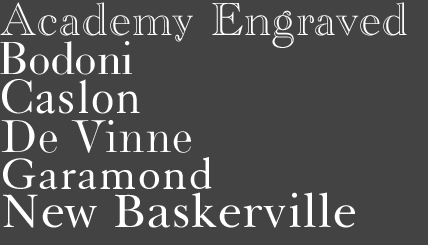
European type designers in the 16th and 17th centuries
took the art of typography to its highest point in history. Designers
such as Garamond, Bodoni and Caslon designed
the beautiful serif typefaces that we still use today. Geoffrey
Tory wrote and designed the famous Champs Fleury,
the manual of modern type and typesetting, unsurpassed even today.
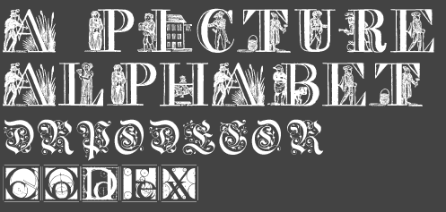
Baroque Typography too uses initials as well as a lot of scrolls
and flourishes. Again bear in mind that these have to be used sparingly
and the initials never in full sentences.
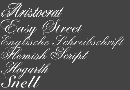
The beautifully flourished calligraphic scripts
of the Baroque era
can be incorporated into contemporary design with great fascility.
Be careful not to confuse these with the brush scripts of mid 20th
century graphic design.
19th Century/Art Nouveau

The overwhelming characteristic
of late 19th century, Art Nouveau type is its curvaceousness and
almost plantlike lines and
forms.
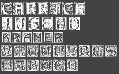
Again Art Nouveau
type uses a lot of initials, and again
remember never to use these as full words, only accents.
Art Deco/Early 20th Century

Early 20th Century typefaces distinguish themselves by being predominantly
sans-serif. A clever typographic innovation
however supplants serif typefaces and these are the demi-serif fonts:
Fonts that have no serifs but show serif type attributes in that their
horizontal strokes are narrow and vertical strokes are thick, i.e.
Broadway or the elegant Peignot. Be
careful not to use these demi-serif fonts outside of an Art Deco retro
context since they are virtually confined to this era. Art Deco/earl
20th century typefaces are strongly geometric, shaped out of circles
and triangles like Premiere or Bauhaus,
and again you should be careful when using these fonts out of their
own contexts.
1950's Retro

These are extremely playful fonts, with
lots of individuality. The boxed ones are especially nice. These will
immediately evoce a "retro" feel when used, so be extremely careful
not to use them out of context.
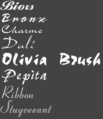
Look at Retro Script and Retro Brushscript very carefully to recognise
its characteristics and how it differs
from other script: Again he keyword is playful.
Also be aware there are some extremely ugly Brushscript fonts
around that haven't been shown here for obvious reasons of taste -
avoid them like the plague!!!
Mood/Concept
These should be more or less self evident. I have given one
example for each, amongst the thousands to choose from. When
chosing "mood" type remember your type can also have stylistic,
i.e. era, geography,
cultural references. This is especially applicable to food
and fashion industries: A restaurant can be both "Elegant" and "Chinese",
a clothing store can be both "upbeat" and "50's retro",
etc...
Upbeat
Sports, Entertainment, vacation, youth, energy, soft drinks

Hygienic
Medicine, health, household
![]()
Romantic
Nostalgic,
soft, warm, curvaceous

Corporate
Serious, understated, legible
![]()
Techno
Computers, telecommunication
![]()
Grunge/Graffiti
Urban, rebellious

Appetising
Food and Food Packaging

Minimalistic
Design, Architecture

Elegant
Fashion, elegance, catering

http://www....
For the screen
![]()